Publication design, including cover art, interior infographics and illustrations, chapter cover art and diagramation.

Illustrations were inspired by modern and contemporary art, especially abstract and concrete painting and sculpture. The aim was to illustrate a cultural centre's role as a focus point for dynamic cultural manifestations without fundamentally linking representations to a certain regional or temporal influence.
Extended rationale of the project
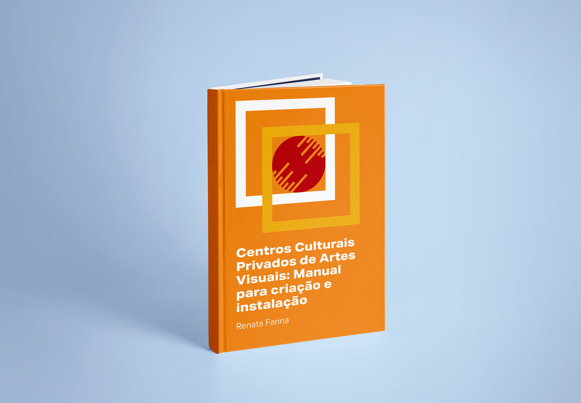
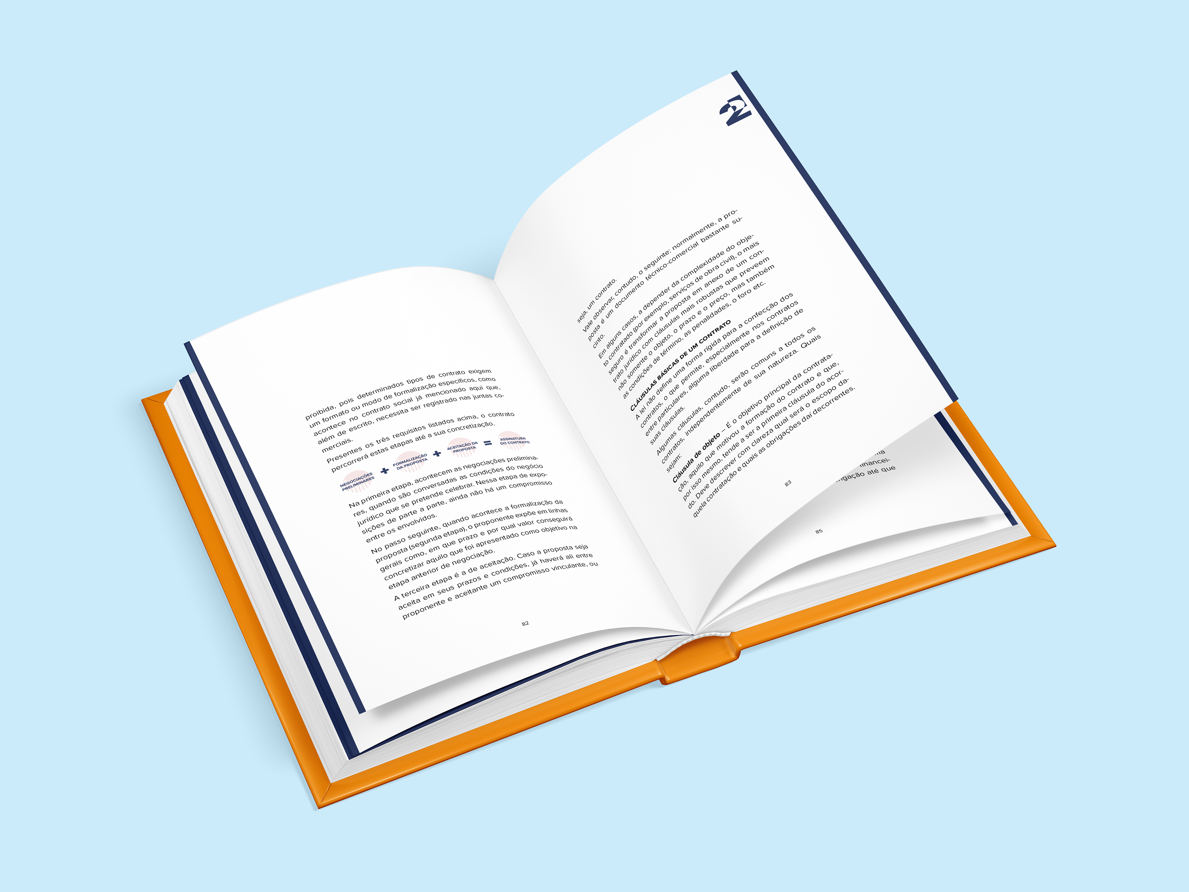
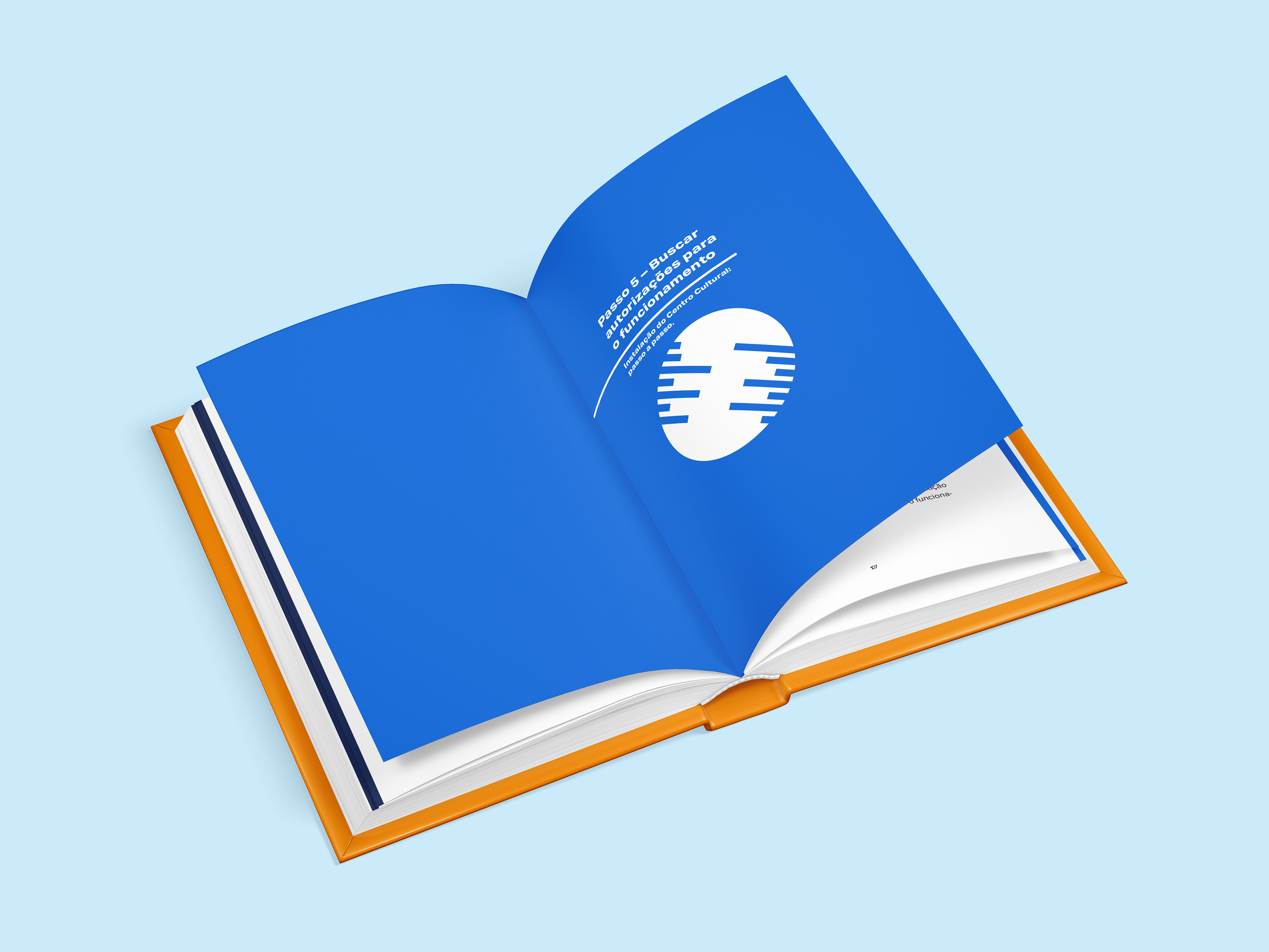
The guiding idea of the composition of the product was that of a laid-back seriousness, provided with sufficient dynamism to illustrate content that is essentially technical, but that is exposed in an accessible way. Betting on the colors to give a cheerful and relaxed tone, a lively and strong palette was chosen. With two colder tones, two warmer and a yellow mediating the two sides, a range of combinations is obtained that forms the basis of the identity of each section and gives the necessary highlights. The use of colors in the body of the text and in the illustrations is always more discreet than in the opening of chapters and subsections, so that the text does not lose its central role. In addition to the use of solid colors, from the effects of overlapping colors new expressive possibilities are obtained, especially in the supporting graphic elements.
These elements are composed based on the central idea of the product, which is the construction of a cultural center. As a place that is both informative and playful, where contemporary cultural manifestations can be observed in their most immediate form, the constructed elements reflect assertiveness and dynamism, without leaning towards corporate standards of visual communication. We look for inspiration in references of contemporary and abstract Brazilian art, building with basic forms a language that can be understood universally - without any distinctive mark of one or another cultural manifestation, since the purpose of the product is to serve all types of cultural center. Basic shapes, overlapping lines and colors, crossings of diagonals and controlled chaos: these references support a visual identity that reflects the contemporary character of the cultural expression and dynamism of the organization around it, embodied in the cultural center.
Typography is based on established types that stand between geometric solidity and subjectivity full of personality revealed in small details. This allows us to translate the idea of a product aimed at the general public, but based on strictly technical knowledge. For titles and highlights, Aktiv Grotesk was used, a font that manages to be flashy and interesting, but at the same time neutral and universal, lending authority to the text without making it exaggerated. For text and notes, Proxima Nova was used, a type of modern proportions, geometric appearance, with generous spaces for types and lines, providing a pleasant reading experience without any hiccups or interruptions.